Byadmin
From Screen Glow to Printed Ink: The Math & Art of Gamut Mapping (RGB to CMYK)
Have you ever spent hours perfecting an eye-popping poster design on your monitor—complete with glowing electric blues, vivid neon magentas, and crisp tropical greens—only to pick up the printed batch and feel an immediate wave of disappointment? That electric pink looks like faded bubblegum, and the brilliant turquoise turned into a sad, muddy slate.
You are not alone, and your printer isn’t broken. What you experienced is the classic clash between two fundamentally different color universes: RGB (the additive light emitted by screens) and CMYK (the subtractive ink laid on paper).
Bridging this gap seamlessly isn’t magic—it’s applied color mathematics and geometry. In this guide, we’ll break down how color spaces work under the hood, explore the math behind gamut mapping algorithms, and share practical ways to preserve your creative vision whether you are designing from scratch or using modern tools like a free AI poster generator to jumpstart your concepts.
The Two Color Universes: Additive Light vs. Subtractive Ink
To understand why color shifts happen, we first need to look at how light and ink construct color on a mathematical level.
ADDITIVE (RGB) SUBTRACTIVE (CMYK)
Red + Green + Blue = Light Cyan + Magenta + Yellow = Ink
Green Yellow
/ \ / \
Yellow Cyan Green Red
/ White \ / Black \
Red ——- Blue Cyan ——- Magenta
RGB: The Additive Model of Light
Your computer display, smartphone, and TV project light directly into your eyes. RGB relies on three additive primary channels: Red, Green, and Blue.
In standard -bit digital imaging, each channel is assigned an integer value ranging from
to
:
represents the complete absence of light: pure digital black.
represents maximum intensity across all three channels: pure white light.
Because adding light wavelengths increases brightness, RGB is an additive color system. Geometrically, the RGB color space can be visualised as a 3D cube where each axis ranges from to
. This gives us
million possible color combinations.
CMYK: The Subtractive Model of Ink
Paper doesn’t generate light; it reflects ambient room light back to your eyes. Printing inks act as physical chemical filters that absorb (subtract) specific wavelengths while reflecting others:
- Cyan ink absorbs Red light.
- Magenta ink absorbs Green light.
- Yellow ink absorbs Blue light.
In print production, colors are measured in percentages from to
. Layering
Cyan,
Magenta, and
Yellow on paper should theoretically absorb all visible light to produce black. In reality, real-world chemical pigments contain impurities, so mixing pure CMY results in a muddy dark brown. To fix this and save money on ink, print presses use a fourth dedicated channel: Key (Black), resulting in the CMYK model.
What is a Color Gamut? Visualizing 3D Color Volumes
In color science, a gamut refers to the specific range or subset of colors that a given device can produce or reproduce.
Think of gamuts as 3D shapes suspended inside a master, device-independent reference color space called CIE . Developed by the International Commission on Illumination, CIE covers the entire spectrum of human vision:
represents perceptual lightness (from
black to
white).
represents the red-green axis.
represents the yellow-blue axis.
CIE L*a*b* (Human Vision)
/—————————/
/ sRGB / Adobe RGB Gamut /
/ /——————-/ /
/ / CMYK Ink Gamut / /
/ / /—————/ / /
/___/___/_______________/___/___/
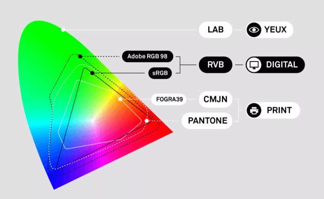
When you overlay digital display gamuts (like sRGB or Adobe RGB) against commercial print gamuts (like SWOP, FOGRA39, or GRACoL), a stark reality emerges: the RGB color volume is vastly larger than the CMYK color volume.
When you choose a hyper-saturated neon cyan with RGB coordinates , that coordinate exists far outside the boundary of printable CMYK space. It is out-of-gamut. No physical combination of physical ink on paper can reflect light with that level of purity.
Gamut Mapping Mathematics: Squeezing Big Shapes into Small Boxes
When software converts an image from RGB to CMYK, it uses an International Color Consortium (ICC) profile to recalculate spatial coordinates. The software must decide what to do with points that lie outside the target gamut boundary.
To measure how far apart two colors are perceptually, color engines calculate the Euclidean distance () in
space:
When
, the human eye usually cannot perceive any difference. When
, the shift becomes noticeable.
To manage out-of-gamut points, color management systems use four mathematical algorithms known as Rendering Intents:
1. Perceptual Rendering (Best for Photographs)
Rather than simply cutting off out-of-gamut colors, Perceptual rendering scales the entire source color space down uniformly until it fits within the smaller CMYK boundary.
- The Trade-off: Colors that were already in-gamut will lose a small amount of saturation.
- The Benefit: Relative spatial relationships between neighboring colors are strictly preserved, preventing color banding and preserving smooth gradients in natural photos.
2. Relative Colorimetric Rendering (Best for Branding & Vector Art)
Relative Colorimetric checks each color point individually. If a color is already inside the CMYK gamut, it remains untouched. If a color is out-of-gamut, the algorithm projects it straight to the nearest available point on the CMYK outer surface.
- The Trade-off: High-saturation areas can lose subtle tonal detail (highlight clipping).
- The Benefit:
of your image’s colors remain
mathematically identical to the original file.
3. Absolute Colorimetric Rendering (For Proofing)
Similar to Relative Colorimetric, except it does not adjust for the paper color (white point). If the destination paper is slightly yellowish, Absolute Colorimetric prints a tiny tint of ink to simulate that paper shade on a proofing stock.
4. Saturation Rendering (Best for Charts & Infographics)
This algorithm ignores color accuracy entirely in favor of maximum brightness. It stretches out-of-gamut values to the absolute edges of the target gamut to keep colors bright, making it ideal for business bar graphs and presentation slides.
Modern Creative Workflows: From AI Tools to Print Preparation
Understanding color math completely changes how you approach creative tools—especially in modern workflows that move at lighting speed.
Many contemporary designers, marketers, and content creators kick off projects by using a free AI poster generator to quickly explore layouts, generate imagery, and test visual concepts. Because AI engines run on digital graphics cards, they produce outputs natively in the sRGB color space. When you ask AI for a “vibrant synthwave concert poster,” the output relies heavily on hyper-saturated sRGB values that light up monitor LEDs.
If your goal is to turn that AI-generated visual into a physical print display, here is how to bridge the gap without losing quality:
┌─────────────────┐ ┌─────────────────┐ ┌──────────────────┐ ┌─────────────────┐
│ AI Generation │ ───► │ Soft-Proofing │ ───► │ Manual Color │ ───► │ CMYK Conversion │
│ (sRGB Space) │ │ (ICC Profile) │ │ Adjustments │ │ (Perceptual) │
└─────────────────┘ └─────────────────┘ └──────────────────┘ └─────────────────┘
- Keep Your Original in RGB: Always save your primary master file in RGB format. Converting to CMYK prematurely discards color data permanently, rendering the file less versatile for future digital uses.
- Enable Soft-Proofing: Before sending your file to print, open it in software like Photoshop, Illustrator, or Affinity Photo and activate Soft Proofing using your printer’s specific ICC profile (e.g., U.S. Web Coated SWOP or GRACoL 2006). This simulates CMYK conversion on-screen.
- Turn on the Gamut Warning: Enable your editor’s Gamut Warning overlay. Gamut-limited regions will highlight in a vivid overlay color (usually grey or red), showing you exactly where neon hues will dull down.
- Make Intentional Manual Adjustments: Instead of letting the automated rendering engine flatten your colors blindly, use Selective Color or HSL adjustment layers. Shifting an unprintable neon green slightly toward emerald green often preserves visual punch far better than letting an algorithm pull out saturation indiscriminately.
4 Rules of Thumb for Print Perfection
- Mind Your Total Ink Limit (TAC): In CMYK, layering
of all four channels equals
total ink coverage. Paper cannot absorb that much moisture without smudging, tearing, or bleeding. Keep maximum ink coverage under
(or check your print provider’s guidelines).
- Master “Rich Black”: Pure K black
can look weak and grey on large poster backgrounds. Use a Rich Black formula—such as
Cyan,
Magenta,
Yellow, and
Black (
TAC)—for a deep, velvety dark finish.
- Calibrate Your Monitor: Color math is only as accurate as your display’s baseline settings. If your screen brightness is set to
with a cool temperature bias, your prints will consistently turn out darker and warmer than expected.
- Request a Hard Proof: For high-volume or critical print runs, always request a physical proof from your print house before approving the full run.
Wrapping Up
Color in digital media is a dynamic balance between physics, mathematical formulas, and artistic intent. Translating designs from screen to paper isn’t about accepting compromise—it’s about understanding how color gamuts interact so you can stay in control of your creative output.
Whether you’re crafting vector branding from scratch or leveraging a free AI poster generator to fast-track your creative ideas, mastering gamut mapping ensures that what you see on screen is what you ultimately hold in your hands.